Digital Marketing today has completely evolved to a more deeply interactive and more dynamic strategy in brand building.
And marketing automation exists to assist and support content creators and business owners alike to streamline their workflow, increase productivity and focus on tasks that require creative attention—saving time and resources along the way.
Based on significant data, the marketing automation market is seen to grow a 9.8% increase from 2020 until 2027.
For entrepreneurs that have maximized the potential of social media and other online platforms, utilizing tools to match the demands of the audience has become a necessity.
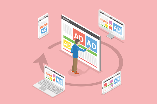
What is Banner Advertising
Marketing campaigns can be delivered in various ways and on different platforms. You can go for email marketing, social media marketing, blogs, vlogs, banner designs, and more. There are advantages to all these different ways you can market your brand or business.
Banner advertising works like a digital billboard, utilizing dynamic visuals and a core message that quickly grabs the attention of your target market.
With a great banner design, you can communicate your marketing goals, invoke curiosity and get those clicks coming in.
These visuals on your banners are key—whether they’re animated or not, the important thing is you’re able to deliver what you’ve been intending to market.
You can incorporate a link that users can click and redirect them to your site or your social media platforms for more details and information about your brand. It must be linked to an appropriate landing site that will meet your readers’ expectations.
A great banner ad can drive more leads to your site, increasing traffic and the potential for more conversions.
But what makes a great banner design? Some of the things you might want to consider:
1. Bring the Colors Out
A great mixture, delivery and application of colors in your ad can invoke certain moods and attract the reader to take a second look at it. Make it professional.
Color schemes and color palettes that bring out the message you want to deliver must be considered. Another thing, it needs to be consistent with your branding theme.
Remember, the color scheme you use depends on your current marketing goal and it must make an impression the first time people see it.
2. Simple Layouts
Banner templates don’t need to be flashy to catch attention. Encompassing the totality of your visuals, the singularity and neatness of a good and simple layout appeals to the eye.
There is balance when you look at it, and it’s not cluttered. You can add photo manipulations like filters to improve the image or a blur effect so that you can emphasize one section of the layout.
3. Message that Marks
It’s important that the message you want to communicate is clear and is easy to capture. When a reader looks at your banner ad, it must deliver the core of your message and at the same time pique curiosity, making them click the link further and visit the landing page intended. The message must hit the spot and deliver the outcomes you expected.
We have curated 10 Successful Banner Ads to provide insight for your next campaign:
10 Examples of Successful Banner Advertising
1. Banner Ad #1: MSC Cruises
Founded in Naples, Italy, MSC Cruises remains a global cruise line based in Geneva. This 10-second banner ad they delivered is simply eye-catching. They transformed their usual poster ads/ graphics to video form and it works.
With their tagline “Only the sea, Only MSC” being embodied in that 10-second banner ad hit the core of their message. The ad promotes MSC Cruise as back in action with their discounts– you can still cruise with confidence with MSC.
Instead of using the usual static banner ad, they elevated it and made it more dynamic and eye-catching, making you want to click further and explore your options with them.
2. Microsoft
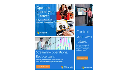
Visual-wise, Microsoft has always been consistent with its design and branding theme. They have used design elements that have always aligned with their branding strategies.
It’s no different with their banner templates. Scaling is well done and the typography they used has that consistency to it, that the moment you look at the ad, you’d know it belongs to Microsoft.
They’ve utilized the transparency element to highlight the colors as well as the text. The photos they choose are reality-based scenarios that make them relatable to anyone.
3. Wells Fargo

This banner ad by Well Fargo is straightforward and clear. It aims to promote their credit card and the perks that go along with them.
They did pretty well on putting the big number on top, as it catches anyone’s eye immediately, creating curiosity. The reader will then proceed to read through the whole ad to capture the whole idea.
The $0 annual fee is catchy, of course, but some terms and conditions apply; although design-wise, it’s pretty good as it pulls the reader in.
With the standing offer to receive bonus points for the first three months of signing up, and a possibility of gaining more on certain categories.
The customer’s curiosity has been awakened and there is a huge probability that they’ll go over to the site and know more about this offer.
4. Dyson

Dyson is a UK-based household appliances company and specializes in manufacturing top-of-the-line appliances like vacuum cleaners, hairdryers, heaters, etc.
This specific ad by Dyson incorporates a testimonial to the ad. Incorporating a testimonial to the ad is a great tool to increase conversion rates. It goes alongside the sales pitch and can again, increase curiosity among readers why this product got a 5-star rating.
Especially in this ad, it simply shouts that this product has exceeded the customer’s expectation and with that clickable “Learn More” tab, it leads them directly to the solutions they’re looking for.
5. Balsam Hill

With the holidays just around the corner, Balsam Hill has come up with this banner ad and delivers its promotion with simplicity. The invitation to “Shop Now” invokes expectation and at the same time, as a reader, you’d want to know what’s in it for you.
The simplicity of their layout and the utilization of the typography in place isn’t too flashy, but it embodies a homey feeling and anticipation for the holidays.
The design elements were balanced accordingly and the layout is symmetrical, framing the ad cleanly and eliminating visual clutter. It’s simple, straightforward and might just get you to “shop now” for the upcoming holidays.
6. CM.com
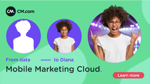
CM.com’s banner design would undoubtedly catch your attention immediately.
Their core message is clear and they used animation as an important design element in this ad.
Using a person to represent the brand seems somewhat personal and relating a message that data delivered in your hands—you can personalize by accessing their mobile messaging channels. It made it more relatable to say the least.
The color scheme chosen was also a good match. It’s eye-catching, but at the same time it’s not too flashy.
It’s well balanced, design wise, when you look at it, even when you open it in your mobile phone. This ad was to push through their latest mobile marketing campaign on personalizing profiles.
7. New York Times

As expected from a top new source, their banner ad encapsulates who they are. Even in their banner ad, they make sure they headline it accordingly. It’s straight to the point and strategic at the same time.
The call to action to “subscribe to the Times” and to see where your options’ at is pretty straightforward as well.
The former refers to them as a news provider being able to ride the wave of current events and deliver news that matter to you; and the latter—your call to accept the invitation to get informed and explore your options to read more and finally subscribe.
When the message is direct and a call to action is in place, it’s easy for a reader to follow through.
8. LG’s V30

This banner ad on LG’s mobile device is something to take note of. Two banners side by side, making it twice as weighty in terms of communicating something to your potential buyers.
The left banner highlights a review of a trusted outlet saying how this device stands out vs. other smartphones. While the right banner magnified a free offer to support their call to action, meeting your curiosity, should you act now and click the “buy now” button.
The consumer here has found something of value and increases their interest to take further steps to know more about the product at hand, plus the free offer added to the compelling strategy.
9. Lexus
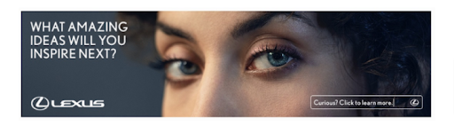
It’s interesting how putting up a human face can really be catchy and also invokes a more personal side to the audience, given that it is displayed in a relatable and humane way.
Even more interesting that Lexus is using this banner design to market their brand and their latest speaker system in the Lexus ES. Truly, this ad embodies Lexus as a front liner in innovation.
It makes more sense now why the banner only focused on the eyes of the model and the upper half of the face. This highlights the human’s senses of hearing and seeing and mostly incites that the speaker system can make your senses come alive.
To note, this is a clickable ad, so the landing page is as important as the banner ad. You will be directed to a landing page that provides further details and information about the new speaker system and the value of sound design and the human being’s sense of hearing.
10. Google Android’s Friends Furever Ad Campaign
This became the most shared ad in 2015 and we now understand why. There are of course many great and compelling ways to market your campaigns, but only a few stand out and hit the core of the human heart—to truly connect with the audience and develop continuity in the message.
This Google Android ad campaign shares the value of animal friendships and this has gone viral on most major social media platforms. It is the most shared ad for the longest time now.

Embed Video: https://www.youtube.com/watch?v=xbHszDDdle8
The fact that animal lovers, pet owners and those that share the love for animals can all embrace the warmth this campaign ad has delivered.
We can all agree that a well-thought ad campaign can engage the audience in a large-scale momentum, without straying away from the main message.
Takeaway
In digital marketing, the content is valuable as well as the message. And whatever you put out there for your brand or business, will be evaluated by readers, consumers, potential customers.
And on your end, you can track it, measure it, and derive insight to make the improvements necessary to level up your marketing campaign strategies.
Banner Advertising has proven to be a way to get your brand recognized and increase consumers’ awareness of your business.
Repetitively and consistently, you must develop creative ways to keep your brand visible so consumers can immediately recognize and remember what you are about.
Of course, it’s easily said and done. But behind a great banner ad is a group of great minds with amazing creative prowess that have spent and invested time and resources to produce something that you’re expected to look at, click and share.
Don’t shortcut your way to deliver a great ad to impress—it’s always a creative process and a collaboration of ideas with the people you work with.
The core of it all is for you to be able to produce something that invokes curiosity, influencing their buyer’s journey and communicating the message that you want your audience to receive.
Author’s Bio:

Shelly Solis is the co-founder of SaaSLauncher.com. She likes to write about digital marketing, technology, SaaS, finance. She has been working online since 2009. She currently focuses on SEO and guest posting services or SaaS companies.